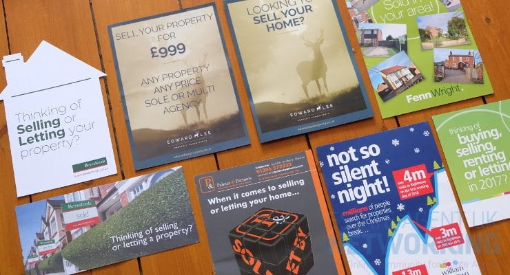
How to Use Print Marketing in Real Estate
As we all know, modern advertising depends in great part on digital platforms – whether it be social networks, e-mail newsletters, or Google Ads. Even in the post-industrial era, entrepreneurs should never underestimate the power of print media. While online images may generate thousands of clicks in a matter of seconds they may just as quickly be forgotten again. If you are striving for a long-standing career in real estate, you need to gain as much exposure as possible through all available channels. The internet might help you to reach audiences all over the world, but selling or renting properties oftentimes requires active networking at a local basis. To that end, posters and flyers have proven particularly useful – provided you choose the right design. Here are the most essential tips that real estate agents should consider when creating print ads:
-
Opt for high quality only
Normally, passers-by will only cast one quick glance at an advertisement before deciding whether it is worth taking a second look. If your posters lack in colour or seem out-of-date, they will most likely go unnoticed. To leave not only a good, but a great first impression, you should consider a custom design. Find a reliable online print shop and all you need to do is choose your desired materials, measurements, and designs online. Possible options include:
- sizes ranging from A4 to A0
- eco-friendly paper or shock-proof plastic sheets
- fabrics for indoor purposes and laminated posters that withstand rain, wind, and sun.
Adapting your advertisements to their respective environment, you can rest assured that they will never fail to present your properties in the best light possible.
-
Keep it simple
While you may feel tempted to present potential customers with a long list of strong selling points, you should always adhere to the mantra: Less is more. The longer it takes to process the contents of an image, the sooner we will lose interest. With that in mind, try to limit the visual design to a few selected elements which altogether contain the most important information. A sense of simplicity can be achieved if you stick to:
- clear structures that set the headline, body copy, and photos apart
- whitespace (i.e. unoccupied spots in-between texts and images)
- a unicolour background.
Based on these guidelines, you will craft posters that send a strong message without causing sensory overload for the observer.
-
Sell your brand
If you want to achieve long-term success in the real-estate market, you have to keep up with a tough competition. As promising your offers may seem – there will always be a plethora of alternatives to choose from. Hence, you need to build a sense of trust so that potential customers will favour your offer over others. For this purpose, your posters must have a corporate design that makes them stand out instantly to potential customers. Consider the following aspects:
- Do I use a consistent wording, font, and colouring?
- Is my company’s logo easily recognisable on every poster?
- Have I pointed out all USPs (unique selling points) in each advertisement?
To convey a message effectively, you may use both words and images. Let bright photos speak for themselves rather than inserting a lengthy description of an apartment’s light-flooded interior. As the old saying goes, “a picture is worth a thousand words”.
-
Create contrasts
Lastly, you should not be afraid of making bold statements. After all, your posters will only stand out if you take it one step further than your competitors. Stark contrasts between text and images, headline and body copy, or backdrop and foreground also help onlookers to grasp information as quickly as possible. For instance, you can revert to tricks such as:
- adding white text onto slightly darkened photographs
- highlighting content in bold red
- inserting geometric shapes to separate textual from visual elements
- using different font sizes.
While it is important to take some creative risks, you should nonetheless keep in mind that you need to “keep it simple” at the same time. The secret lies in selecting only a few poignant elements which will have a maximum effect within a minimum time frame.


