When Colours and Patterns Clash
Depending on the look and feel you desire for your home, be it harmonised and blending to eye catching and featured, we mostly try and follow set rules when it comes to the colours we use along with patterns. We must consider room sizes, natural light, type of room and mood / theme that we are looking to achieve and have we already main furniture / artwork to initially work around?
Colours and patterns can come from paint, wall paper, carpets, flooring and more plus of course all the additions to a room from the furniture to extras such as rugs, vases, bed linen etc. We can simply go for those neutral colours, currently this seems to be lighter shades of grey, which nine times out of ten will be perfectly acceptable though quite plain and repetitive, or we can be adventurous.
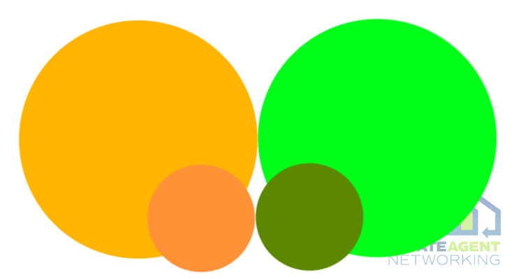
What colours are said to clash? This happens not only from colours, but also on how similar they are such as in brightness (luminance) for instance with orange and green together we can have a clash or we can also have quite an acceptable partnership if we tone things down slightly.

colours clashing can be due to brightness
Most clashing colour pairings will appear to clash because of discrepancies in hue or luminance as per above and it is not always easy to determine how well, or bad, colours go together unless we have them in front of us to study.
Hue is considered as the “colour family” from which the specific colour comes. There are 12 hues on the colour wheel. Therefore, every conceivable colour falls into one of these twelve colour families.
Luminance is defined as the perceived brightness of any given colour. The stronger and brighter the colour is, the higher its luminance. Also, colours with more added white (tints) are more luminant as well because they are perceived to be brighter. source colorbux
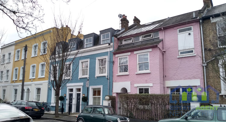
It is said that blue & green as well as pink & red are the main two sets of which to avoid, especially if giving each 50% of the area within a room. With mixing of patterns, which can suddenly be too busy if paired incorrectly, it is important not to go for too many bold designs which can lead to a room feeling crowded, chaotic and difficult to digest visually. When mixing patterns, especially via wall paper / carpets / rugs / curtains, a top tip is to vary scales and colours so to better harmonise.


