


The impact of colour on your kitchen makeover
We all know that the kitchen is the heart of the home, but this knowledge doesn’t necessarily make it easier to style the space we now routinely use not just for cooking and dining but for relaxing and socialising too. In terms of product design and interiors themes, there’s never been such a wealth of choice.
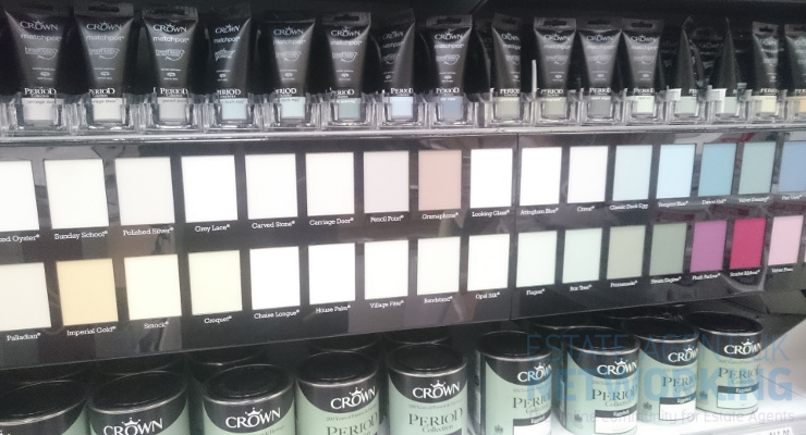
Take colour, for instance. Without going too deep into the science of colour psychology, we know that colour has the power to affect us mentally and physically in a myriad of different ways. Are there good and bad colours for the home? Which is best for kitchens? Let’s take a look at some of the most popular kitchen colour themes and see what the different hues say about you.
Whites, off-whites and neutrals
Received wisdom tells us that, if in doubt, install a white or neutral kitchen. White is associated with cleanliness and hygiene, perfect for food prep spaces, and a light colour scheme helps to bounce the light around the room, maximising the sense of space. From brilliant white to ivory, alabaster and taupe, choose these colours to create a warm inviting atmosphere for spending time together en famille or with friends.
It’s little wonder that white and cream kitchens having been topping the popularity polls for many years. They’re the most versatile choice for your home and go with everything. Whether you’re a fan of traditional kitchens or contemporary interiors, neutral schemes are infinitely adaptable and able to produce elegant rooms or modern backdrops.
Greys and blacks
Dark colours in the kitchen can be tricky, particularly when you’ve chosen black or dark grey that can literally suck the light and life out of the room. The worst case scenario is that you end up with a dark and depressing space that will need industrial amounts of bright lighting before anyone wants to spend time there.
Used cleverly, however, a grey or black colour scheme can work beautifully, particularly in a contemporary setting. While black in combination with other bold hues (red, orange, yellow, chrome and white) can look garish and aggressive, reminiscent of the macho 1980s bachelor pad, team dark hues with white or neutrals for a softer effect. At its best, black or grey has a commanding presence, oozing elegance, decadence and power.
Shades of green
Take a leaf out of Mother Nature’s palette and invest in a green kitchen. Green is the most harmonious and balanced colour to the human eye, channelling peace and relaxation. From gentle sage to dramatic teal, barely there hints of apple to dark mossy hues, green works particularly well in traditional kitchen designs and country settings. You’re literally bringing the outside in.
Did you know that the colour green embodies healing and hope? Choose a green room scheme for a calm and serene ambience, and pair it with other natural materials such as solid timber worktops and natural stone flooring, or vice versa. Don’t forget to add glass to give a clear view into the garden.
Blue hues
It is a well known association that the colour blue makes us think of the endless sky and sea, giving a sense of tranquillity. It’s why blue is the ideal choice for bedrooms. But perhaps it’s a good idea to also add some calm and comfort into the busy home hub that is the kitchen?
Blue is the colour least associated with food, on account of there being almost no naturally occurring blue foodstuffs, and it’s been scientifically proven that blue suppresses appetite. Whether you choose a pale baby blue or a strong azure shade, go duck egg or midnight blue, it will be a peaceful and restful place to spend time in.
A riot of red
A well known symbol of love and passion, red also signifies danger, fire and blood. In fact, a stronger colour it is difficult to imagine. Did you know that seeing red has been scientifically proven to increase blood pressure and raise your heart rate? A red kitchen is a bold and exciting choice made by a confident homeowner!
From Ruby Red to Fuchsia Pink, a red kitchen makes a real statement that will dominate your interiors. Put it centre stage and celebrate the energy, or tone it down with neutrals or white for a softer effect.
Oranges and lemons
Orange is a happy colour, symbolising creativity and celebration. A wonderfully warm and stimulating colour that won’t fail to make you smile, orange can make a huge impact in any interiors scheme. To create a calm and relaxing kitchen vibe, please look elsewhere.
Yellow is another energetic and joyful colour, though the brightest hues can be tricky to work with in large quantities. Yellow is said to increase your mental focus, while lemony shades can add a cleaning refreshing ambience to your home. This colour is not easy to combine with other shades from the colour wheel – try dark green, brown or maybe grey or chrome.
You May Also Enjoy

Beach hut values fall for second consecutive year
Burnham’s property and land tax: what would it mean for property owners?
Homebuyers can save up to 47% by looking next door to the UK’s priciest postcodes

Your First-Time Buyer Mortgage Journey

London property values set to fall