


Why Mobile-Friendly for Real Estate Matters

If you thought having a mobile friendly website was a luxury and not having one wouldn’t affect your business…. Think again!
Earlier this month Google Webmaster released this statement; “Starting April 21, we will be expanding our use of mobile-friendliness as a ranking signal. This change will affect mobile searches in all languages worldwide and will have a significant impact in our search results. Consequently, users will find it easier to get relevant, high quality search results that are optimized for their devices.”
What does this mean for you and your real estate business? That SEO and getting to the top of Google search results just got a bit trickier. Your website might currently be ranking somewhere near the top for desktops but that doesn’t mean it will when someone searches on a mobile device. And this might lead to Google bumping you down the list whilst other mobile friendly websites pip you to the post.
The fact of the matter is; the advancement and popularity of mobile devices has changed the way people are consuming online information and viewing websites; and Google is simply making the necessary changes to suit the ways the masses are operating online.
In plain English; this means mobile is no longer a luxury but a must if you want prospects to find your website.
Time to Get Responsive
The total number of mobile devices is set to rise to 2.6 billion by 2016 – up from 1.9 billion in 2012. That’s huge! And chances are that figure will grow even more with the continued development of mobile wearable devices (Android wear, Apple Watch, and Google Glass); therefore it’s crucial for business’ going forward to understand how design impacts engagement.
So what can you do to make sure your website provides the best user experience? Opt for a responsive design.
What is Responsive Web Design?
Responsive Web Design is a format that allows a website to flex and scale up or down to fit the size of screen it’s being viewed on. Meaning someone viewing your site on a smartphone will be shown the same site as the person viewing it on a desktop or laptop but the site will notice the constraints and automatically reformat to suit that device. This means no more zooming in to find the content you’re looking for, it simple re-adjusts to suit the viewer. Responsive design also acknowledges interaction and makes your site easier to use by taking into account and integrating things like touch screens to aid navigation and user experience.
Here’s an example of what we’re talking about
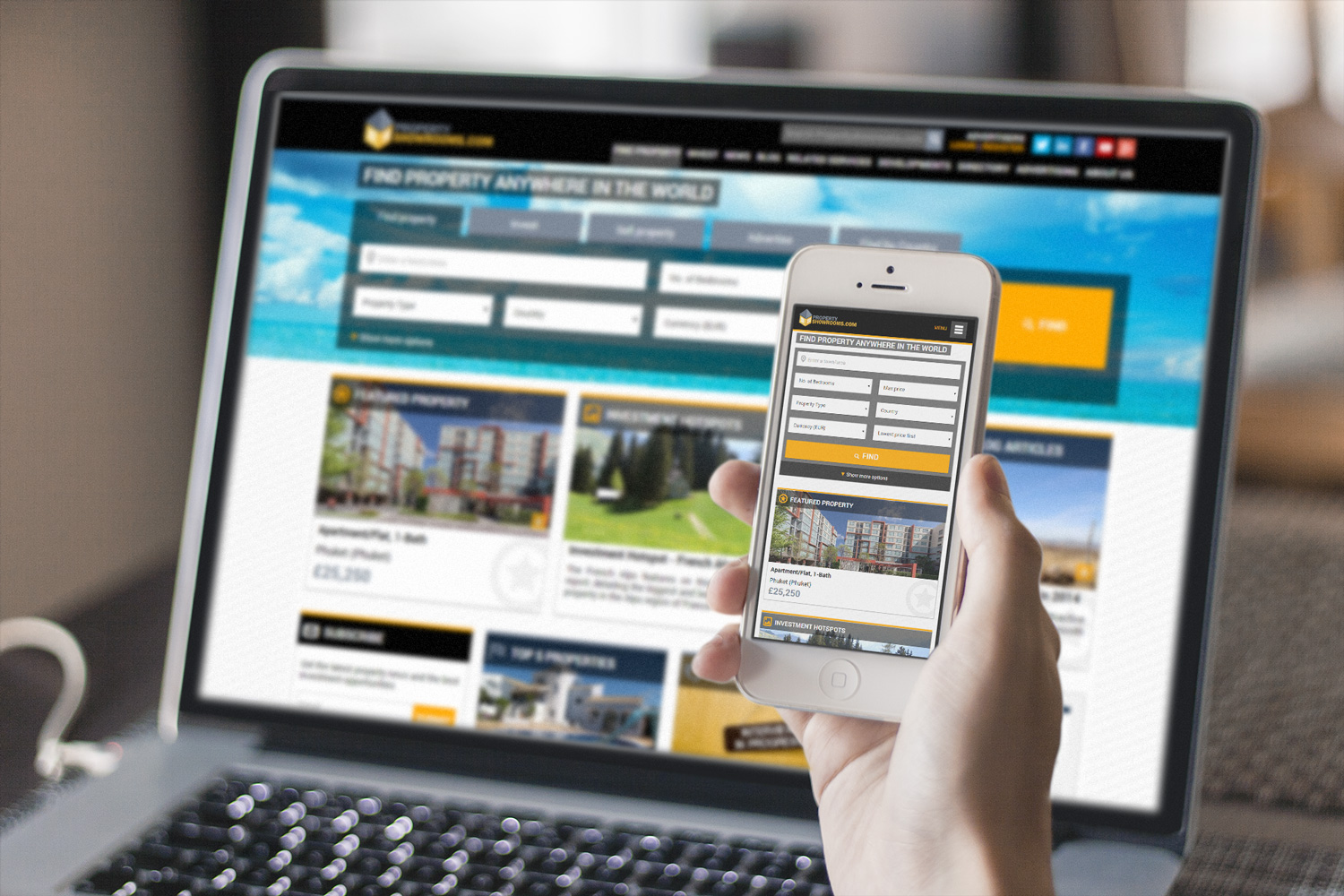
Or why not take a look at how Propertyshowrooms.com operates on your mobile device to experience a responsive website? Don’t worry I’ll wait for you to come back.
Responsive Emails
It doesn’t stop at having a responsive website, responsive emails are just as important.
Did you know that although you can near enough do anything on a mobile device nowadays email is still the most used functionality? According to Exact Target’s Mobile Behaviour Report (2014) a whopping “91% of consumers check their email at least once per day on their smartphone”.
That’s great news for everyone right? Well… not exactly, it’s only good news for companies delivering responsive emails. Why? Because users have a tendency to delete emails that don’t load properly on the device they’re using. In fact according to BlueHornet’s study on Consumer Views of Email Marketing (2014) “if an email does not display correctly, 71.2% of users will delete it immediately.”
Therefore failure to deliver responsive emails could fatally damage the ROI of your company’s email campaigns.
How We Do Responsive
At Propertyshowrooms.com we’ve been creating mobile responsive emails for over 2 years now, and we’re stunned that we’re still in the minority of businesses doing so. Let me explain why that is; we use sophisticated software to track the success of our email campaigns across all devices and we found that a whopping 48% of our email campaigns are opened on mobile devices, 35% are opened on webmail and just 17% on desktop. That means that by using a responsive email design we’re able to cater to 100% of our clients as opposed to just a mere 17% if we did not.
You can view some of the responsive email campaigns we’ve created for clients here.
Don’t worry we know that not everyone has the in-house resources to create responsive emails (there’s actually quite a bit of design work that goes into it) but there are plenty of email providers out there to choose from who you can pay for responsive email services.
And if it’s real estate specific emails you’re looking for get in touch with one of our agent account managers to find out about what we could create for you.
Got more questions about optimizing your business for mobile users? Let us know in the comments below.
You May Also Enjoy

Your First-Time Buyer Mortgage Journey

London property values set to fall

London property values set to fall

Second-steppers turn to higher LTV mortgages as deposits fall
Breaking Property News 23/7/26